Wayfer
brief_
CLIENT: Ferreira & Filhos SERVICE: Branding; Advertising; Service Design; Coaching; Training SCOPE: Empathy; Research; Briefing; Strategy; Ideation; Building; Prototyping; Testing; Implementation TOOLS: 4K Process; Workshop Sprint; Co-Creation; Scrum; Lego; Kamban; Post-it TEAM: Ricardo Traquino; André Coelho; Isa Romão; João Meneses; Luís Guimarães LOCATION: Portugal
Ferreira & Filhos is a family business that started in Leiria in 1992, and since then has been the official representative of IVECO brand for the central region of Portugal. In 2018, Ferreira & Filhos reached out to CO+K to transform their business. Today the new Wayfer has achieved a turnover of 10 million €.

challenge_
In the VUCA world, the theme of urban mobility is increasingly relevant and essential for the business of over 80% of Ferreira & Filhos’ clients. Focusing hugely on its customers and with a strong desire to be at the forefront, F&F felt the need to transform its business value proposition and brand positioning.

outcome_
Definition of a new positioning in the commercial vehicle sector, presentation of a value proposition focused on mobility for professionals and keeping its partnership and exclusivity with the IVECO Portugal brand.
The project included the development of the corporate strategy, brand architecture, communication tone, and visual identity, as well as implementing the above throughout different services and products. This resulted in profound changes in the company’s corporate culture, made possible through a disruptive project that was internally given the code name “the CO+K project”.
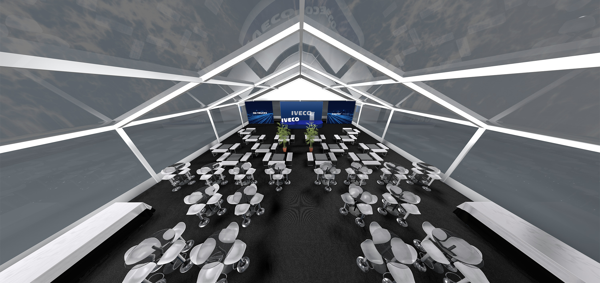
CO+K worked for nearly a year on this endeavour, developing a 360º branding project that included: core elements, broadcast identity, and online presence, above and below the line advertising, internal and external communication, social media, corporate graphics, media and events, retail spaces, vehicles, packaging and merchandising, among others.
visual identity_
The project started with a Sprint Workshop with a multidisciplinary team which turned out to be a “journey” throughout the different services and products in the Transportation Sector and Urban Mobility, adjusted to the needs of F&F and its clients. This resulted in a differentiating and unique brand concept in this industry.
MOVING AS ONE
The project comprised the creation of a new brand through the application of a new, more modern and agile typography, reducing distances and fulfilling the new value proposition: Greater proximity to the client. The choice of the colour “IVECO Blue”, and the creation of the new “Moving As One” tagline, summed up the new philosophy of the company.
We followed with the development of a rich graphic universe (both in terms of visual and photographic resources), as well as its application to a series of communication pieces that ranged from printed materials to graphic advertising, the corporate website, associated websites, the App, physical spaces and merchandising, among others.


graphic system_
From the lines of automobile movement as a representation of the Wayfer experience and by extracting its contours, we created a collection of standard images that serve the application in the different offline and online touchpoints of the brand, thus supporting a consistent communication.


Corporate and Communication_
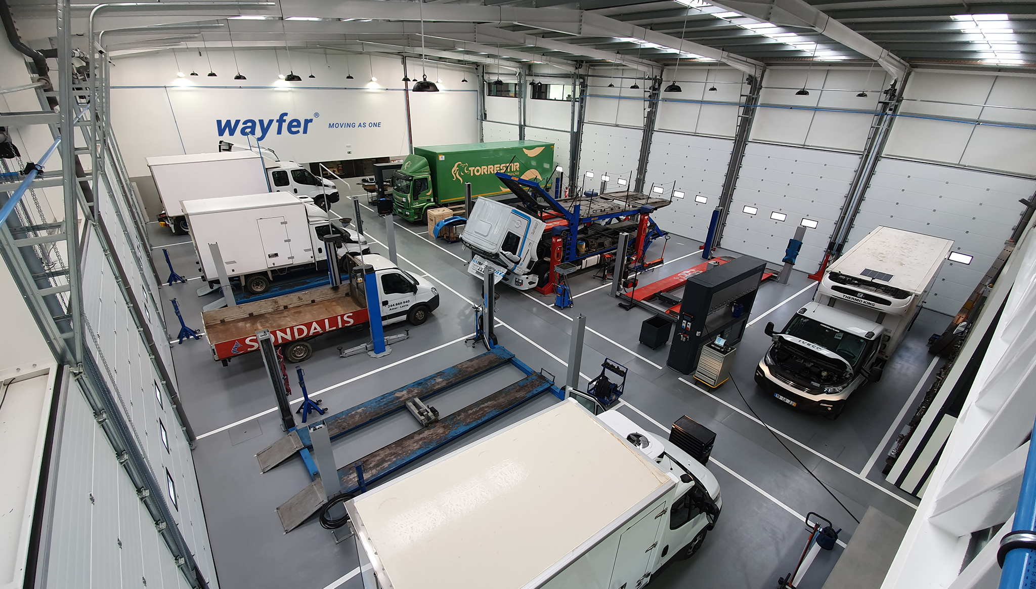
Wayfer’s communication had to transmit the strategic idea and positioning. The graphic system allowed us to combine the several elements (logo, symbol, layout, and photographs) on a diverse range of contact points such as labels, packaging, exterior advertising, digital advertising, social and digital media.
application_
For the launch of the new brand, we designed many applications, from the corporate stationery to informative brochures, flyers, bags, technical sheets, merchandise, etc., as well as other materials that can now be used for incorporating future services, such as a digital app.


