Savile
brief_
CLIENT: Salvador & Falcato SERVICE: Naming; Branding SCOPE: Empathy; Research; Interviews; Briefing; Strategy; Ideation; Building; Prototyping TOOLS: 4K Process; Workshop Sprint; Co-Creation TEAM: Nuno Mendão; André Coelho; Isa Romão LOCATION: Portugal


challenge_
At a global level, the paradigm of management consultancy, auditing and financial firms is mostly limited to the so-called “Big Four”. These follow strict corporate codes, innovating in their own identity and creating niches with their own language. The challenge for Salvador & Falcato was to present the same excellence as the “Big Four” but without losing engagement and proximity with their clients.

outcome_
Definition of the value proposition, including the development of the corporate strategy, brand architecture, communication tone, and visual identity, as well as implementing the above throughout different services and products.

identity_
Based on the initial guidelines and expected deliverables – a new Salvador & Falcato brand logo and institutional website – the project started with a Sprint Workshop that culminated in a new strategic reflection based on two fundamental insights:
-Delineate Salvador & Falcato’s own value proposition space, allowing it to have an adequate discourse to the new reality.
– Become the best option for small and medium-sized businesses that cannot access the “Big Four” but value the same quality and professional excellence.
From this, we created a value proposition that answered to the defined positioning: “We are ex-Big Four; we offer technical rigour combined with work capacity and the values of excellence and trust, but with the dedication, proximity, engagement and adjusted price that only a personalized service allows”.
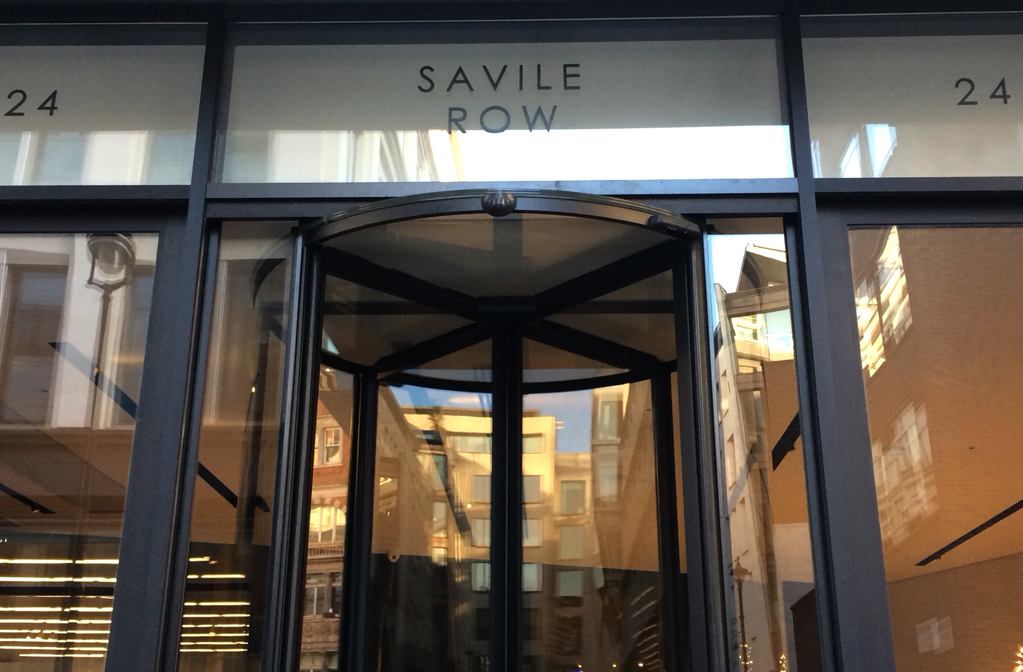
And from this idea of a tailor-made service, we got to know Savile Row. We travelled to London and interviewed the best tailors in the world, thus finding the solution to our problem.
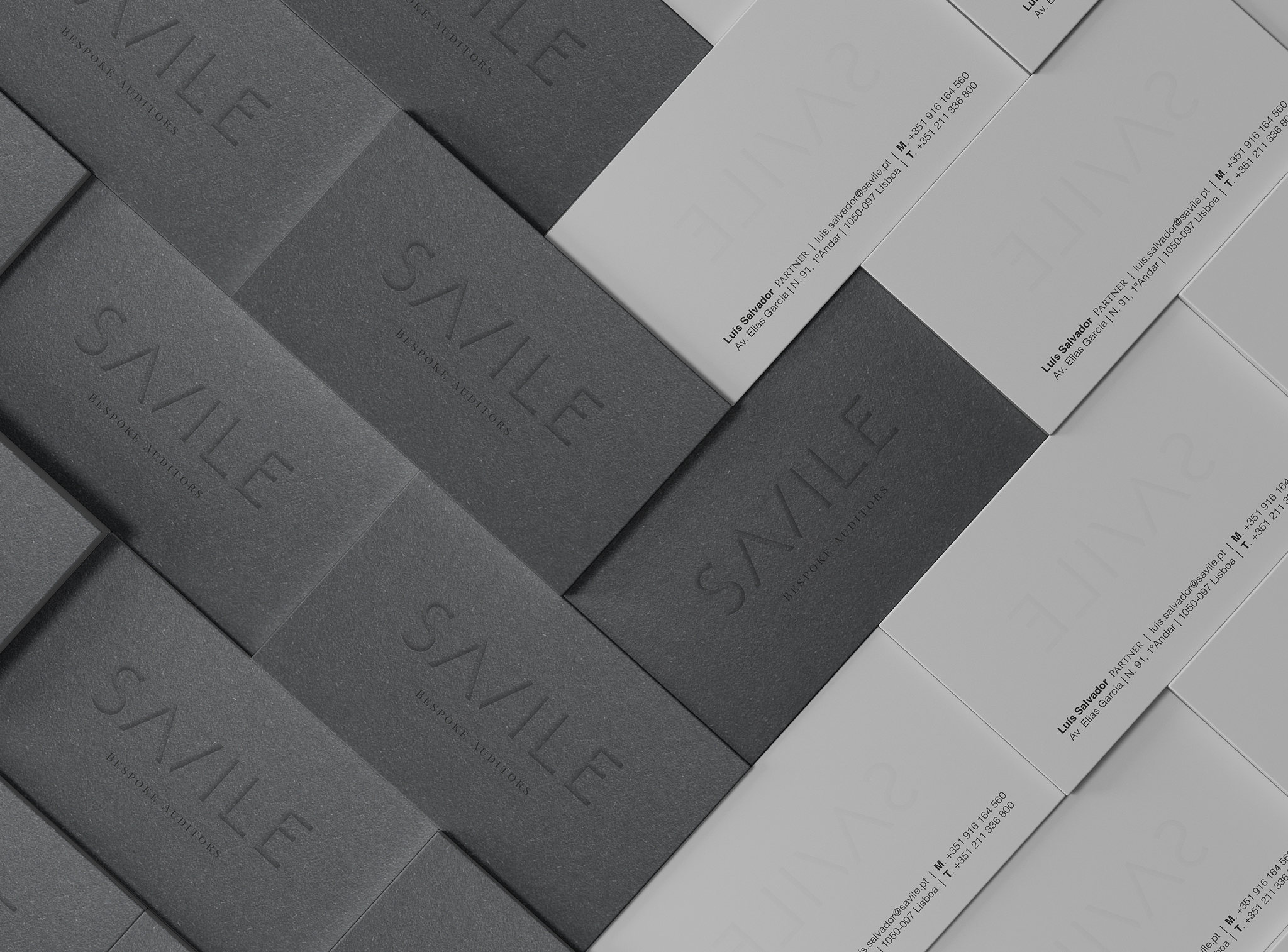
Salvador & Falcato began presenting itself as the new SAVILE brand. A powerful main name, easy to pronounce, concise and practical. Drawing inspiration from the personality and attitude of UK’s Savile Row St., the crème de la crème in traditional and classy tailoring. The new SAVILE brand became complete with a tagline comprising two words:
Bespoke Auditors
Bespoke – Tailor-made. Each client is a client. Inspired by the terminology of traditional tailoring. A show of tradition and experience. Auditors – What we are. What we do. Technical expertise and rigour.

graphic system_
The idea of Bespoke Auditors is also present within the graphic system. The entire system respects the brand positioning, constantly referring us to the tailoring imagery.

corporate and communication_
Savile’s communication had to transmit a new strategic idea and positioning. All communication materials allowed us to combine the several elements (logo, symbol, layout, and photographs) on different formats, made with the premium Savile Row paper, with extra cotton to convey a true prestige experience.

application_
For the launch of the new brand, we designed many applications, from the corporate stationery such as labels, to social and digital media, merchandise, among others.


digital_
In digital, we created the UX / UI Design in the different touchpoints of the brand, as well as the graphic system of social media platforms and internal communication.
