Näperõn
brief_
CLIENT: Näperõn SERVICE: Branding; Visual Identity SCOPE: Briefing; Strategy, ideation, Building, Testing TOOLS: 4K Process; Workshop Sprint; Co-Creation TEAM: Isa Romão; André Coelho; Ricardo Traquino; Luís Guimarães LOCATION: Portugal
Näperõn is chef Hugo Nascimento’s first solo restaurant. A kitchen of memories which is focused on the products of the region, overlooking the Alentejo. A memorable experience, as if we were at our grandmother’s house and didn’t have to ask what is there for lunch.

challenge_
A Big Challenge was to sum up the purpose of Chef Hugo’s kitchen in a new brand and concept that reflected the value proposition of the Casas do Moinho – Alentejo project.

outcome_
The development by CO+K of a branding project that includes development of the strategy, Value Proposition, brand architecture, communication tone, and visual identity, as well as the implementation of the above throughout different services and products.


brand identity_
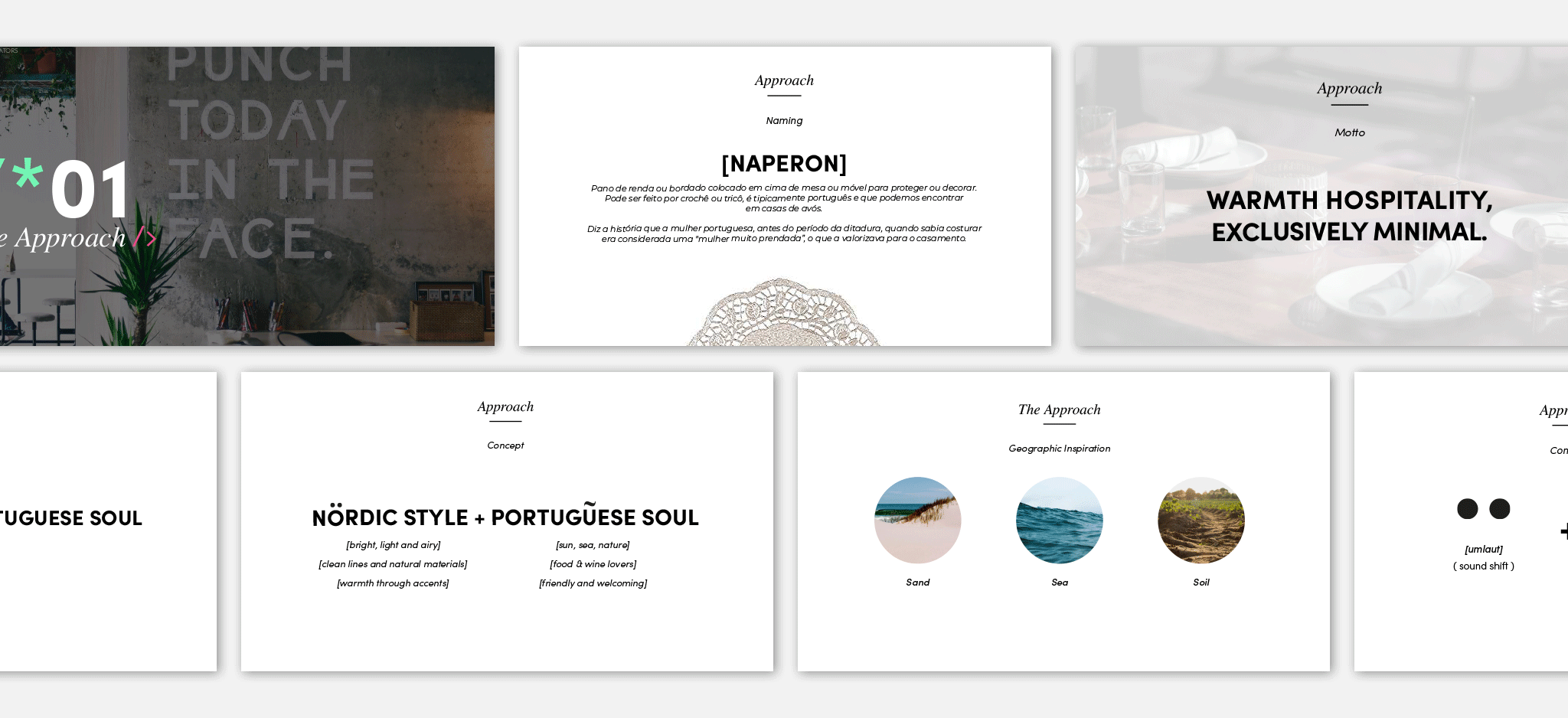
[NAPERON] Lace or embroidery cloth put on a table or furniture to protect or decorate. It can be in crochet or knitted, it is typically Portuguese and it can be found in Portuguese grandparents’ houses.
The story tells us that, before the dictatorship, Portuguese women who knew how to sew were considered “very gifted women”, which valued them for marriage.
WARM HOSPITALITY, EXCLUSIVELY MINIMAL.
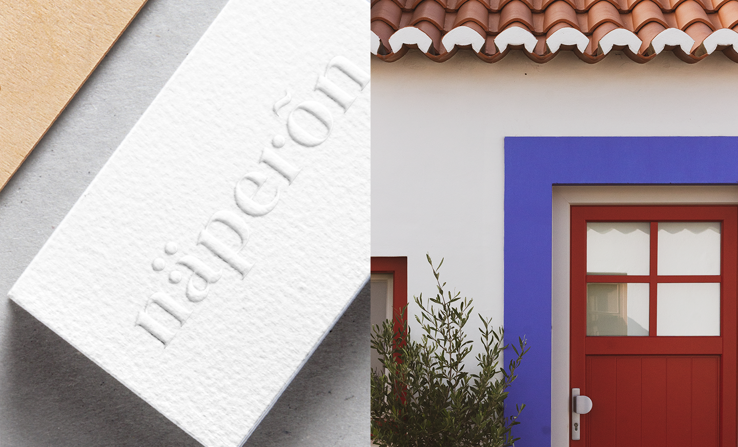
– This is the motto for the development of the brand’s strategy and visual universe. Getting inspired by the sands, sea and Alentejo lands, CO+K worked the Naperon brand taking into consideration the Nordic culture (target of the restaurant). Therefore, the concept goes through the simple representation of the Name Naperon using characters from the northern European script. ~ represents the sea, and ·· the land and sand of the Alentejo coastline.


graphic system_
The idea of nordic style to represent the Sea, sand and soils is also present within the graphic system.
The entire system respects the brand positioning, constantly bringing us back to the big idea of nature.


communication_
Naperon’s communication had to transmit the strategic idea and positioning. The graphic system allowed us to combine the different elements (logos, symbols, illustrations, and typography) on diverse contact points such as labels, packaging, physical products, space design and social media.

application_
For the new brand, CO+K has designed numerous applications, such as menus, corporate stationery, informative brochures, digital social media, merchandise, etc., as well as other pieces that can be used for the incorporation of future services, like digital menus etc.

