Mainova _ Vinhos
brief_
CLIENT: MAINOVA SERVICE: Branding; Product Design; Packaging SCOPE: Empathy; Briefing; Strategy, ideation, Building, Prototyping; Testing; TOOLS: 4K Process; Co-Creation; TEAM: André Coelho; Isa Romão; Susana Venda; Luís Guimarães LOCATION: Portugal
The new MAINOVA Wine Brand is the most recent creation of Herdade da Fonte Santa. More than 20 hectares of vineyards, with varieties carefully chosen by the English wine grower David Booth. António Maçanita and Sandra Sárria are the enologists of MAINOVA wines. In 2020 the brand has been introducing its new wines marketed under its own brands.

challenge_
Leading this wine branding project and defining a clear and efficient brand and product impact with a focus on its strategy and positioning, as well as its visual and verbal identity, while innovating the packaging to gain visibility in the saturated distribution wine market.

outcome_
For this 6 new wine freelances, development by CO+K of a branding project that includes: Naming, Storytelling concept, core elements, broadcast identity, packaging, internal and external communication, social networks visual contents, corporate graphics, merchandising, etc.

visual identity_
The project started off with a Brand Canvas sprint in which 3 different brands were defined for the 6 different references:
MAINOVA – Entry-level wines that inherit the naming of the mother brand and, as a visual concept, the female image of a young farmer.
“DA FILHA MAIS NOVA NASCE UM NOVO VINHO”
If tributes are paid only to the elders, why not assuming, once and for all, that the youngest are the future?
MOINANTE – Alternative and Disruptive Wines such as Castelão single variety Rosé Wine or White Tanning with slow maceration. In the plantation where these wines are born, there is a mongrel dog that keeps watch on the plantation during the night, whereas during the day it spends its time basically sleeping and idling.
Moinante:
– Playful, sociable;
– Lazy; loafer;
– Stray.
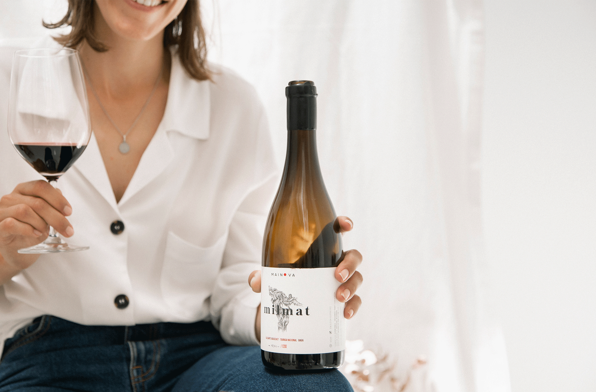
MILMAT – Alchemy of a thousand materials.
In the lands, where the best wines are born. New Wines, ancient customs. Many centuries of practice in combining the best materials and elements resulted in the achievement of the perfect ecosystem to design the best wines. From the mineral-rich terroir to the carefully selected slopes for planting the vineyard.


graphic system_
The realistic illustrations of the young girl Mainova, of the mongrel dog Moinante, and of the old vine for Milmat combined with the circular shape (central element of the MAINOVA Brand) underlie the narrative of each of the packagings. These are the elements that are present in the remaining communication materials of each of the references of Mainova wines.

corporate and communication_
Mainova wines communication had to transmit the strategic idea and positioning. The graphic system allowed us to combine the different elements (logos, symbols, illustrations, and typography) on diverse contact points such as labels, packaging, physical products, exterior advertising, digital advertising, social media, and digital media.


application_
For the launch of the new brand, we’ve designed numerous applications such as brochures, flyers, bags, Wine technical sheets, as well as other pieces that can be used to incorporate in future products, like gourmet Olive oils etc.


